In digital investigations, the abundance of data often equals a lack of time to navigate into the weeds. In today’s investigations, time is often critical and finding the needle in the proverbial haystack can prove daunting.
We added a statistic section to our main dashboard to navigate the enormous amount of data quickly and efficiently. This area gives our users a quick overview of data. Showing favor for this feature we wanted to make this feature even bigger. So we designed an even more comprehensive “Statistic” section that is an overview of the entire extraction and its data to quickly identify sections of interest to the investigator.
Table of Contents
Statistic Section in Oxygen Forensic® Detective
The Statistics section consists of several widgets, all of which are neatly displayed on the screen. The widgets are divided into two categories–data on the device and investigator interaction. Data on the device is displayed in the first widgets and shows the data present within the extraction in charts or tables (Activity Chart, Activity Matrix, Last Contacted, Data Types, Top 10 Applications, Contacts, or Groups). The second group of widgets, or investigator interactions widgets, display the investigator’s interactions with the evidence: assigning tags, marking data as Key Evidence, adding and editing notes, running hash set searches, as well as using Project VIC tags.
Widgets Available After Extraction
- Activity Chart
- Activity Matrix
- Most Recent Communications
- Most Used Applications
- Top Contacts
- Top Groups
- Data Types
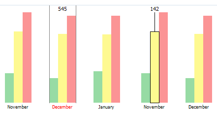
Activity Chart
This new analytical feature in Oxygen Forensic® Detective displays user activity by set timeframes (years, months, etc).
Every event type corresponds to a specific color of the chart column: Calls are shown in green, Messages are marked with yellow, and other events are shown in red. The entire chart scale is divided into equal time intervals: 1 year, 1 month, 1 hour, 1 minute, or 1 second. The intervals can be easily set by the investigator just to the right of the label: Group by. For each time interval, a column filled with the color corresponding to the event type is displayed. If there are multiple event types, a column for each event type will be displayed.
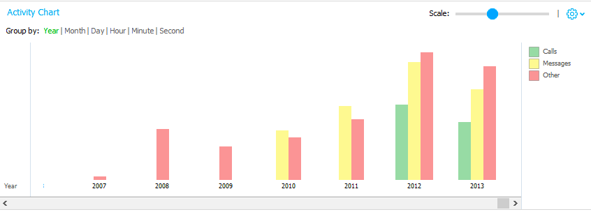
The height of the chart column depends, nonlinearly, on the number of events that occurred within the selected time interval and which type corresponds to the column type. If there were no events during a certain time interval, this interval is not displayed on the chart.
Hovering over the selected interval under the column, the chart will indicate the number of timeline events for this time interval. Likewise, hovering over the column of interest, the number of events of a certain type in the selected time interval is displayed.
Another added feature emerges when hovering over the chart column, a hint showing the last 3 events of the chosen type within selected interval, emerges.
Users can click on the column of interest to switch to the desired time range. The grid switches to the latest (newest) event corresponding to the selected type and time interval.
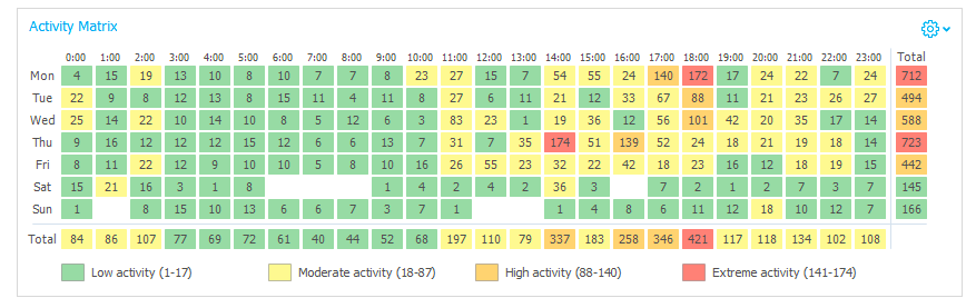
Activity Matrix
This feature helps detect when the device was most used, sorting that information by hours and weekdays.
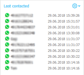
Most Recent Communications
The Last Contacted widget is formed automatically based on data within the extraction. The list of the 10 latest communications is shown with the appropriate app icon, contact name, and timestamp displayed for each communication. Block settings are located within Settings button. Click to open a context menu, filtered by type of communication (Call or Message).
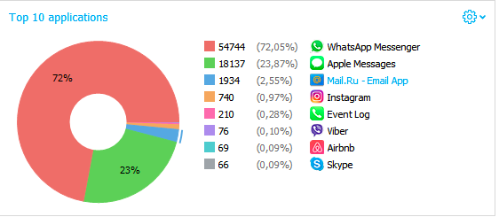
Most Used Applications
This widget is also formed automatically based on data gathered from the extraction. The percentage of communications within the most used applications is shown in a pie chart, with the explication available to the right. There, the number of communicative events, their percentage from all communications within those 10 apps, the application name, and icon are displayed. Block settings are located within the Settings button. Click to open a context menu with chart view settings and to filter by type of communication (Call or Message).
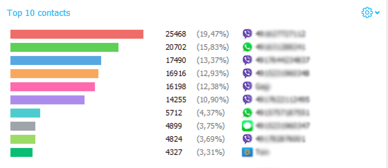
Top Contacts
This chart and its information is compiled and calculated automatically based on data within the extraction. The percentage of communications with the most contacted people is shown in a linear or pie chart, with the contact numbers on the right. This includes the number of communicative events, contact names, applications icons, and their percentage relative to the other 10 most actively contacted chats are displayed. Block settings are located within Settings button. Click to open a context menu with chart view settings and to filter by type of communication (Call or Message).
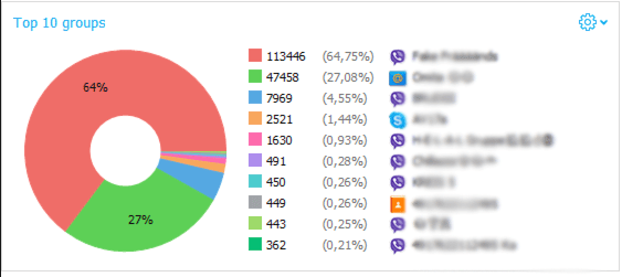
Top Groups
This widget is based on the data present within the extraction. The 10 most used groups are displayed in a pie chart, sorted by the percentage of communication events within them. The explication to the chart, as always, is on the right. There, users can see the color associated with the group, number of communication events within it, its percentage compared to the other top-10 groups, icon of the application where the group chat is, and group chat name. Block settings are located within Settings button. Click to open a context menu with chart view settings and to filter by type of communication (Call or Message).
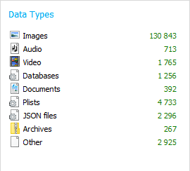
Data types
This widget is also formed based on the data from the extraction. In it, the number of files of each type for the extraction is displayed. Full information about the files of each category could be opened by clicking on a data type of interest.
Widgets Used to Sort Data
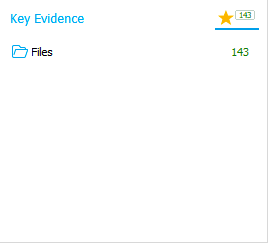
Key Evidence
This section gets filled as a digital investigator identifies and marks data as evidence. Any data which could be important to the investigation, could be marked as Key Evidence to become easily accessible, reviewable, and exported. It is also possible to remove the Key Evidence tag from any event or data.
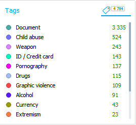
Tags
Tags are yet another analytical feature that changes over the course of investigating the data. Any Oxygen Forensic® Detective user can apply already pre-installed tags, as well as create their own. The tag color can also be changed. Some tags can be added automatically upon running our built in Image Categorization feature. After the Image categorization analysis, the number of matching images for each supported visual threat category is marked with the corresponding tag. Investigators can review the tagged data and manually exclude any false positives.
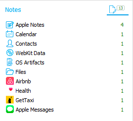
Notes
The Notes section gets filled as the investigator navigates through the evidence, adding notes to the extractions, as well as evidence. All notes can be edited or deleted later. All the notes, added to the evidence, are grouped by the evidence type within the widget.
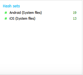
Hash Sets Search Results
This widget is formed from the investigator’s activity. In it, the results of the completed hash set searches are displayed. If the search for a particular hash set was not performed previously, investigators can launch a hash set search directly from the statistics section.
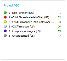
Project VIC
In this block, the data marked with Project VIC tags (if enabled) are shown for quicker access and identification. Click on any of the tags to instantly view data associated with it.
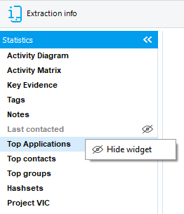
How to View the Available Widgets
Any of the widgets can be hidden and then displayed again depending on the investigator’s desired layout. If any widget is hidden, the corresponding icon is displayed in the left panel, highlighting the hidden block.
Get more from Oxygen Forensic® Detective
At Oxygen Forensics our software is updated multiple times every year. We offer training courses and webinars that can help you learn the ins and outs of Oxygen Forensic® Detective and stay up to date on new features and tools needed for your investigation. Returning customer? Sign up for our newsletter to stay in the loop. Don’t have Oxygen Forensic® Detective and want to try it out? Request a free-trial.