Timeline is an aggregated section of Oxygen Forensic® Detective where all extracted data is displayed in chronological order. Timelines can be created for a device or case, and usually contain valuable insights about calls, web activity, web connections, photos, videos, calendar events, chats within apps, and more.
Table of Contents
Ten ways investigators can utilize the Timeline feature in Oxygen Forensic® Detective
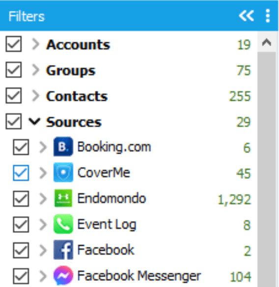
1. Filter entries by source
Investigators can do this by expanding the “Accounts” filter and selecting accounts of interest to view the related data. Investigators can do the same with contacts and groups.
Alternatively, uncheck irrelevant accounts, contacts, and groups to hide the entries related to them. Expand the list of sources to view all the data sources within the extraction. Additionally, investigators can filter the displayed entries by using the checkboxes.
2. Use tabs to view specific records
Use tabs above the grid to view specific records. Switch between messages, calls, files, web activity, and geolocations with one click. The grid will adjust instantly.

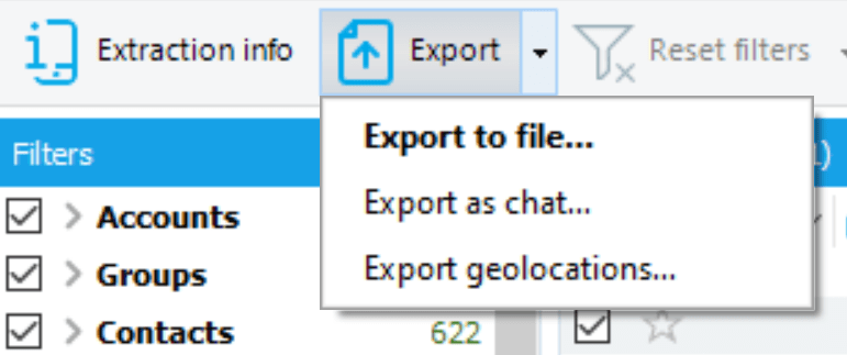
3. Export data directly from the Timeline
Investigators can export all data or choose to extract only chats or geolocations. Click on the arrow next to the “Export” button to view all available options.
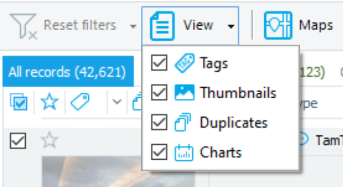
4. Select how much data to display
Select how much data to display in the grid. Click the “View” button to set whether Tags, Thumbnails, Duplicates, or Charts will be displayed in the main grid.
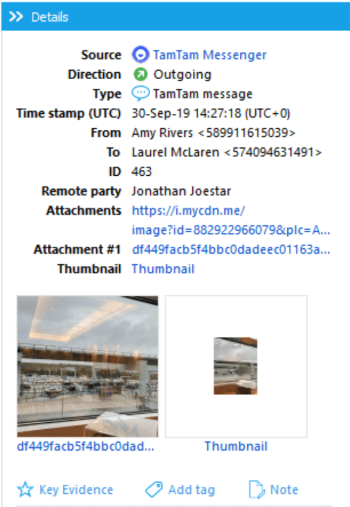
5. Learn more about the entry of interest
Select it in the grid and view its metadata in the right sidebar. There, users can add tags, notes, and Key Evidence marks. Users can also access photos, videos, and listen to audios.
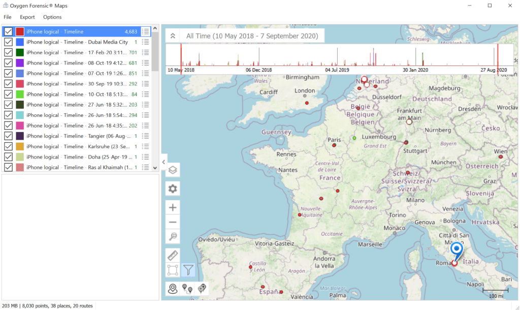
6. View checked locations on OxyMaps
Hit the “Maps” button above the grid. Note that all records are checked by default. To hide irrelevant records, deselect them. Learn more about the capabilities of our Maps section here.
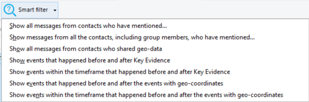
7. Use Smart Filters
The following Smart Filters are available:
- Show all messages from contacts who have mentioned [enter word/phrase]
- Show messages from all the contacts, including group members, who have mentioned [enter word/phrase]
- Show all messages from contacts who shared geodata
- Show events that happened before and after Key Evidence
- Show events within the timeframe that happened before and after Key Evidence
- Show events that happened before and after the events with geo-coordinates
- Show events within the timeframe that happened before and after the events with geo-coordinates.
Read more in our recent blog on Smart Filters.
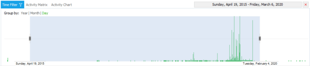
8. Adjust the time filter
Adjust the time filter from the bottom panel. Select whether records will be grouped by year, month, or day, and set the time range either by using the calendar at the top of the panel or by manually shifting the highlighted area.
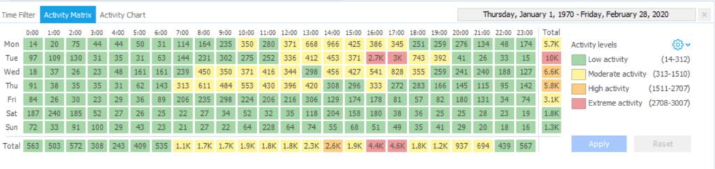
9. View Activity Matrix
View the Activity Matrix by switching to the second tab of the bottom panel.
This feature helps detect when the device was most used, sorting information by hours and weekdays. Every hour of the day is displayed as a rectangle with the number of events written inside.
Each rectangle is highlighted in a color that correlates to the frequency of events in that rectangle: green stands for low activity, yellow for moderate, pale orange for high, and red for extreme. In the Total row, the total number of events per hour is displayed. In the Total column, the total number of events per each weekday is displayed. If there are no events at a certain hour of the week, the cell will be empty.
Use Activity matrix to:
- View activity within a specific hour
- View activity within multiple hours
- View activity within specific hours or weekdays
- View activity within a preset time frame
- View activity within specific applications
10. View the Activity Chart
Go to the third tab to view the Activity Chart. This analytical feature displays user activity in set timeframes (years, months, etc.) Every event type corresponds to a specific color of the chart column: calls are shown in green, messages are marked with yellow, and other events are shown in red.
The entire chart scale is divided into equal time intervals: 1 year, 1 month, 1 hour, 1 minute, or 1 second. Intervals can be set to the right of the label titled, “Group by”. For each time interval, a column filled with the color corresponding to the event type will be displayed. If there are multiple event types, multiple columns will be displayed.
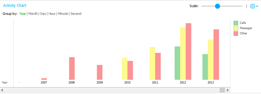
The height of the chart column depends, non-linearly, on the number of events that occurred within the selected time interval. If there were no events during a certain time interval, this interval is not displayed on the chart.
When hovering over the selected interval under the column, the chart will indicate the number of timeline events for this time interval. Likewise, hovering over the column of interest will display the number of events of a certain type in the selected time interval.
We hope this post has been helpful in understanding the capabilities of our Timeline section. Share your experience with us. Positive feedback keeps us moving, while negative feedback helps us make our solution even better!
Get more from Oxygen Forensic® Detective
At Oxygen Forensics our solution is updated multiple times every year. We offer training courses and webinars that will help you learn the ins and outs of Oxygen Forensic® Detective and stay up to date on new features and tools needed for your investigation. Returning customer? Sign up for our newsletter to stay in the loop.
Don’t have Oxygen Forensic® Detective and want to try it out? Request a free-trial.